Brand Expansion • Illustration System • Visual Identity • Print Design • Digital DesignJuneteenth On The East
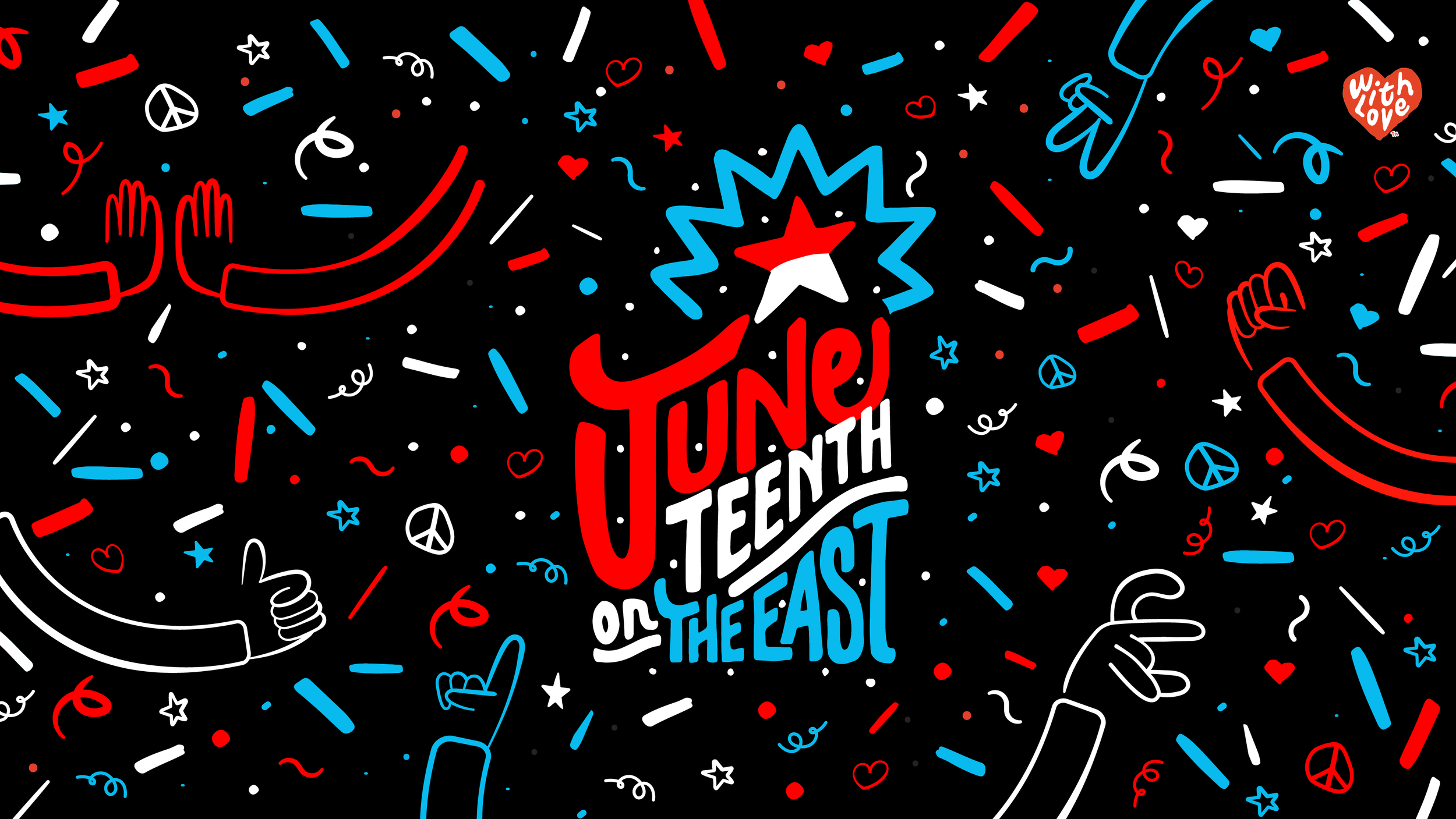
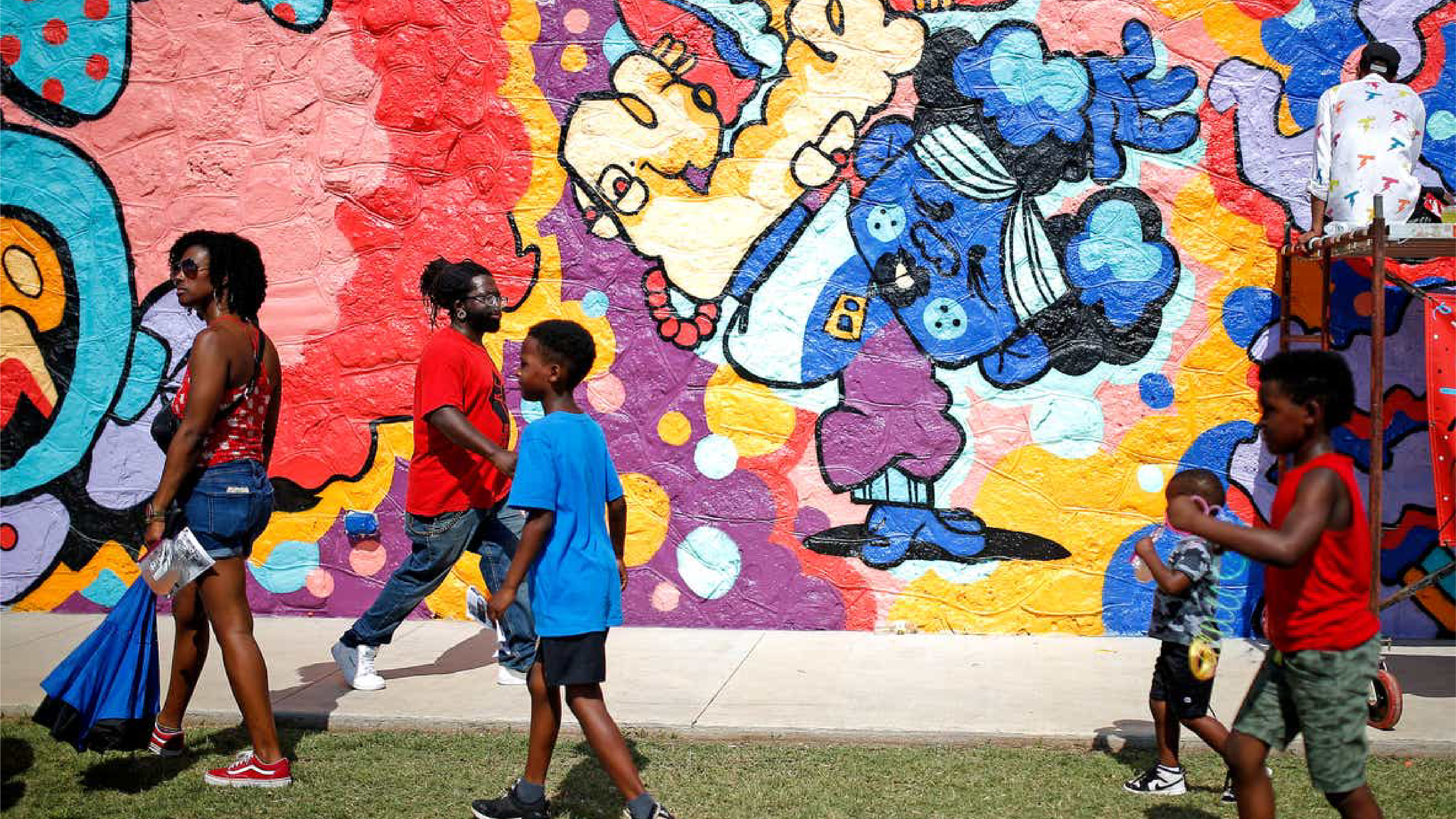
A three-day festival full of family-friendly activities, including live music, murals, dance performances, food trucks, vendors, and a 5K run. It is a celebration of Freedom and Placemaking as they highlight the history of Emancipation in the United States.
-
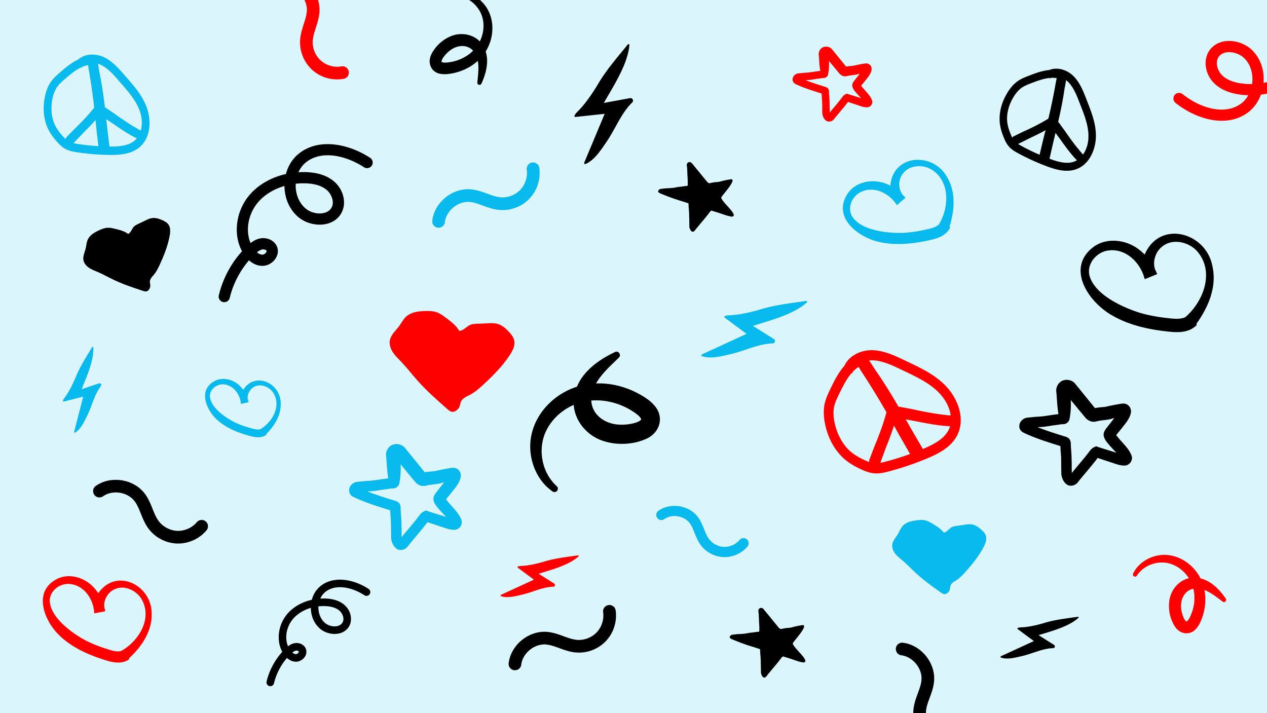
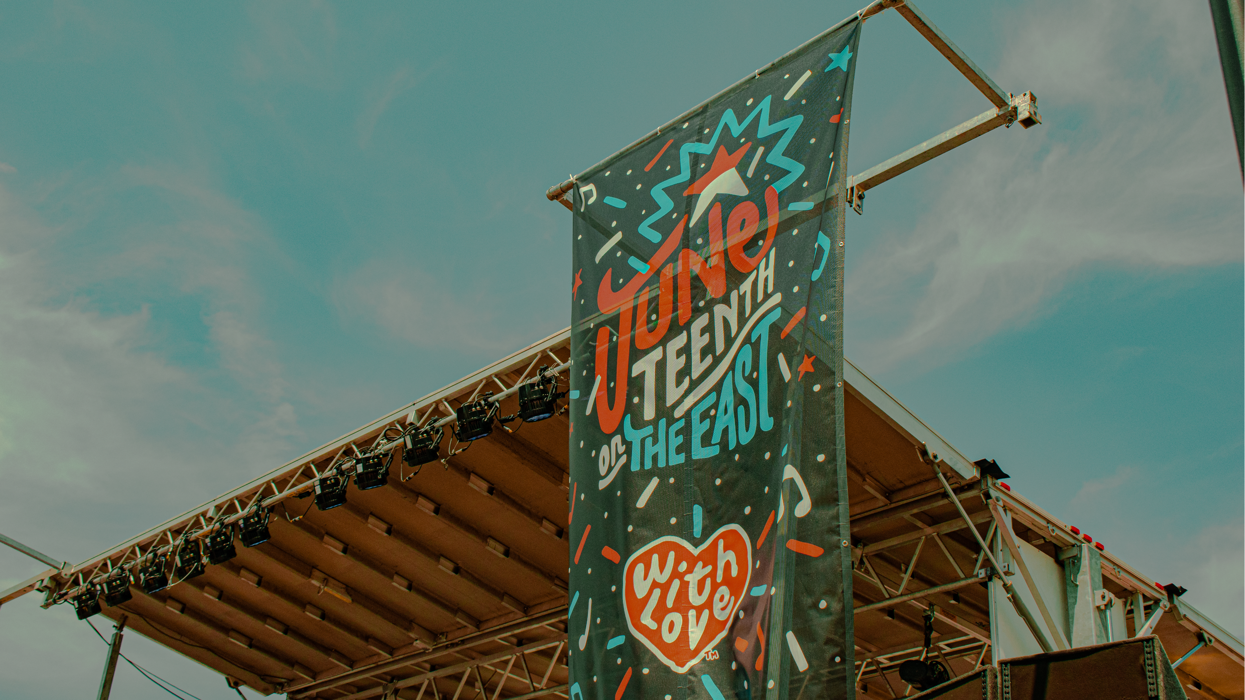
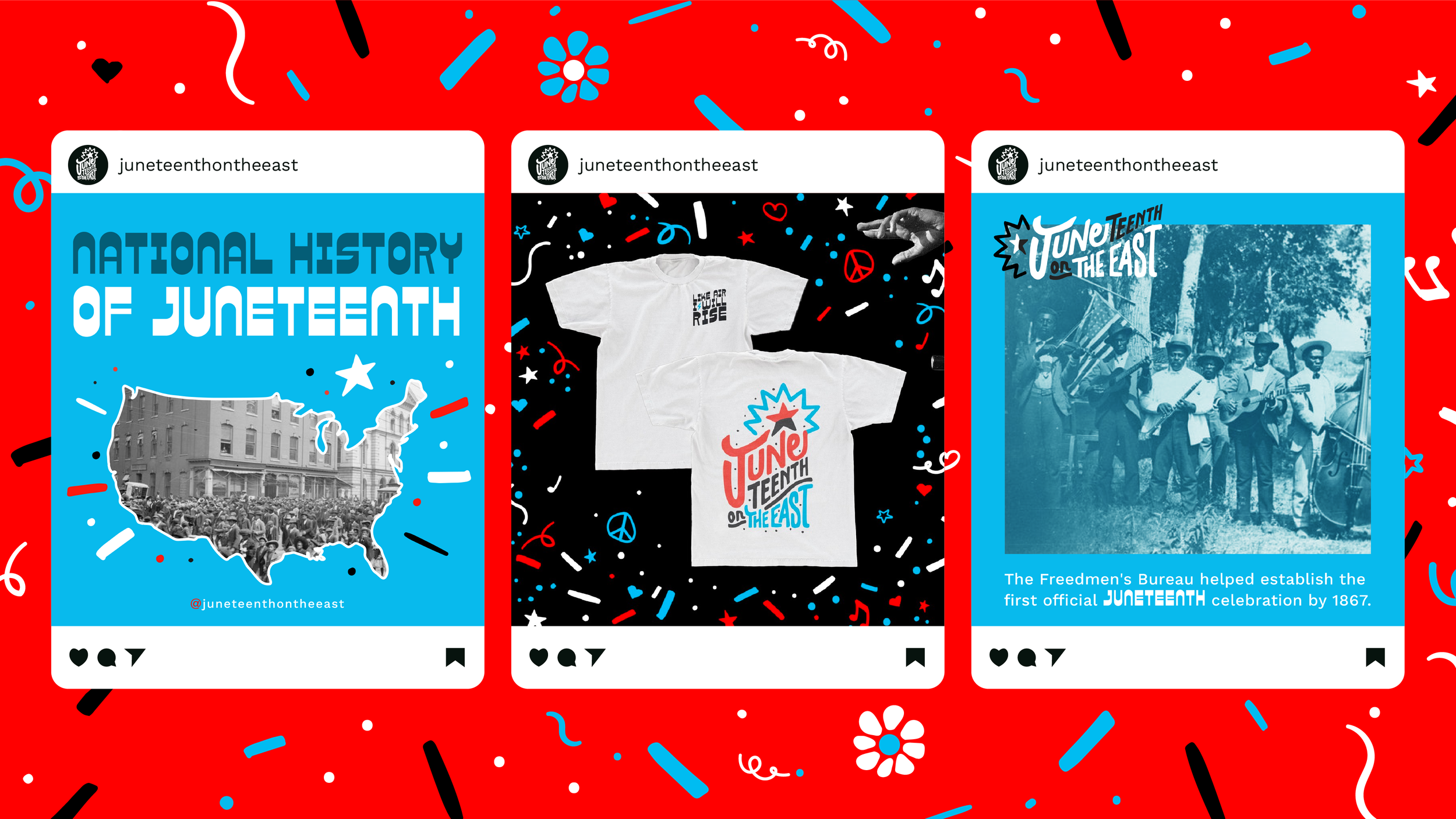
Juneteenth on the East extended brand pattern features added motifs that evoke a sense of celebration, love, and empowerment. There is also a shift in color usage towards more blues and reds, making it more eye-catching and joyful.
-
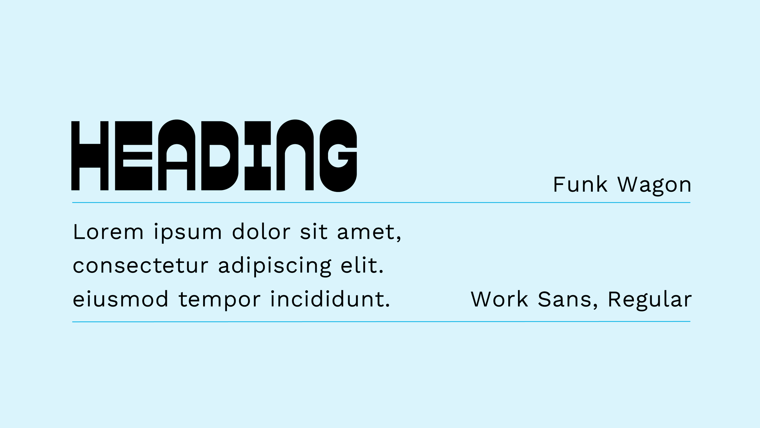
Funk Wagon was selected for its bold, inviting, and playful characteristics that align with the festive spirit of the celebration. It is complemented by the existing brand font, Work Sans, creating balance.
-
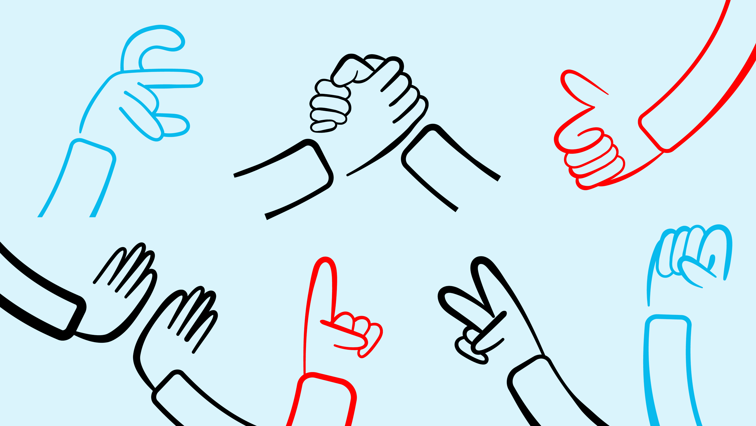
An illustration kit that embodies the festive and welcoming spirit of the Juneteenth celebration. The hand-drawn look evokes a sense of authenticity and community, while the hands themselves symbolize togetherness and unity. Through this illustration system, the Juneteenth on the East festival celebrates the power of community and the joy of coming together.
-
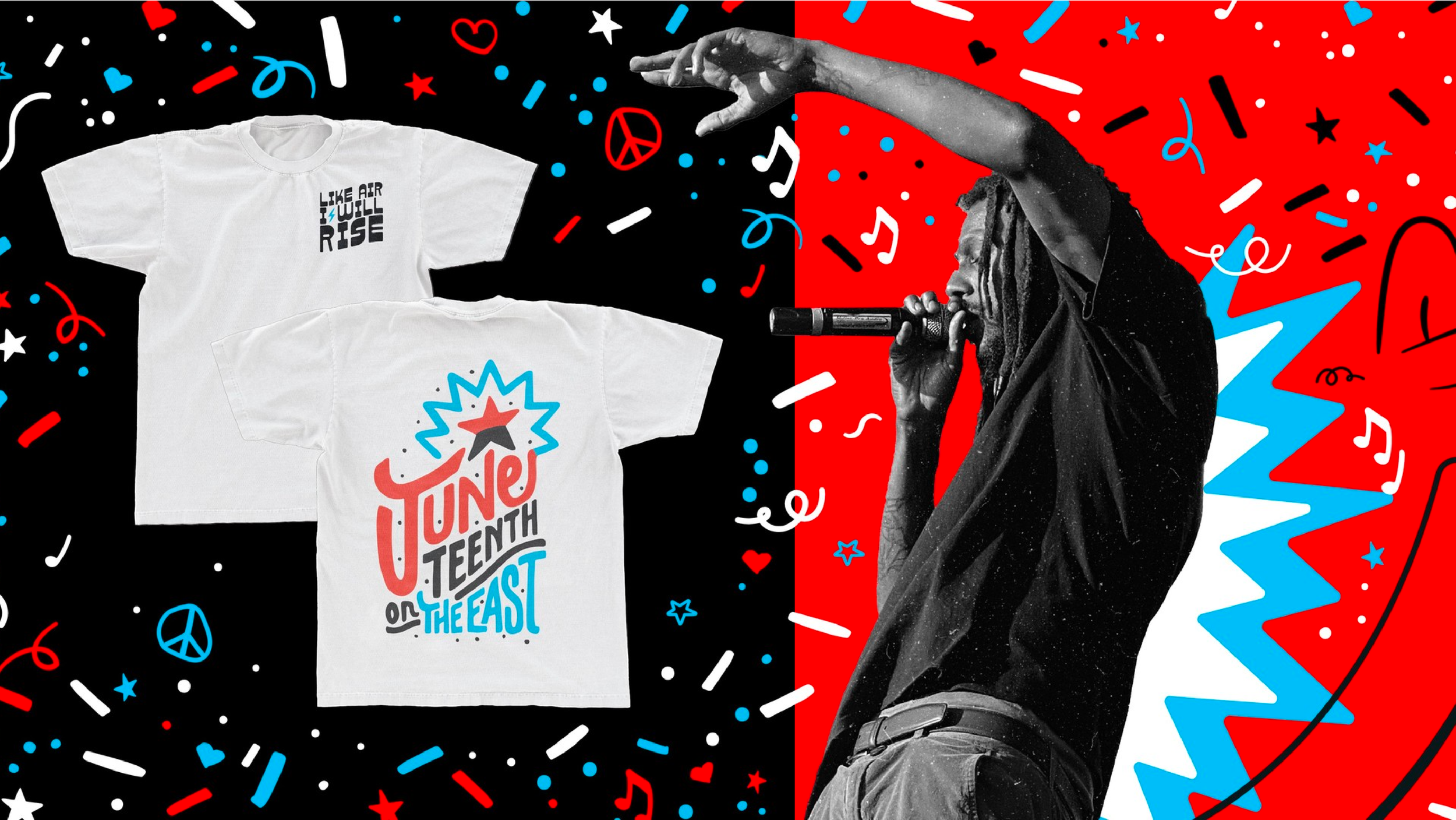
Inspired by Maya Angelou's poem "Still I Rise," which encourages those to rise above adversity and love themselves fully. The use of the bold brand type, Funk Wagon, along with a lightning bolt and movement, embodies the spirit of the Juneteenth celebration.
-
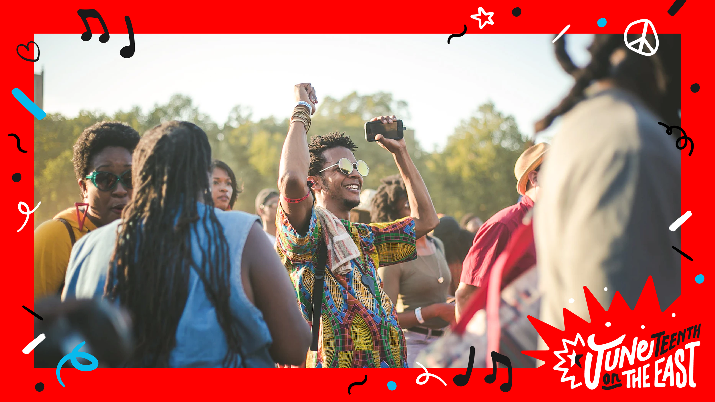
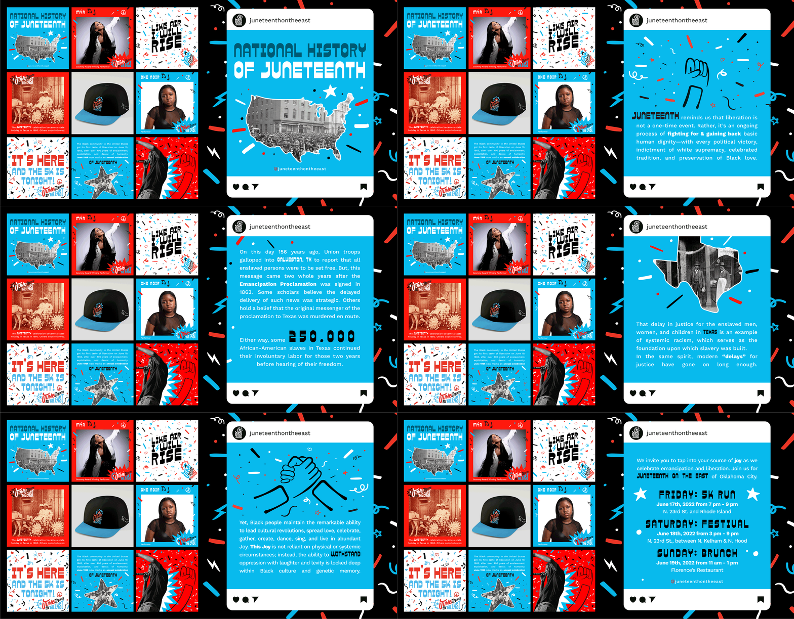
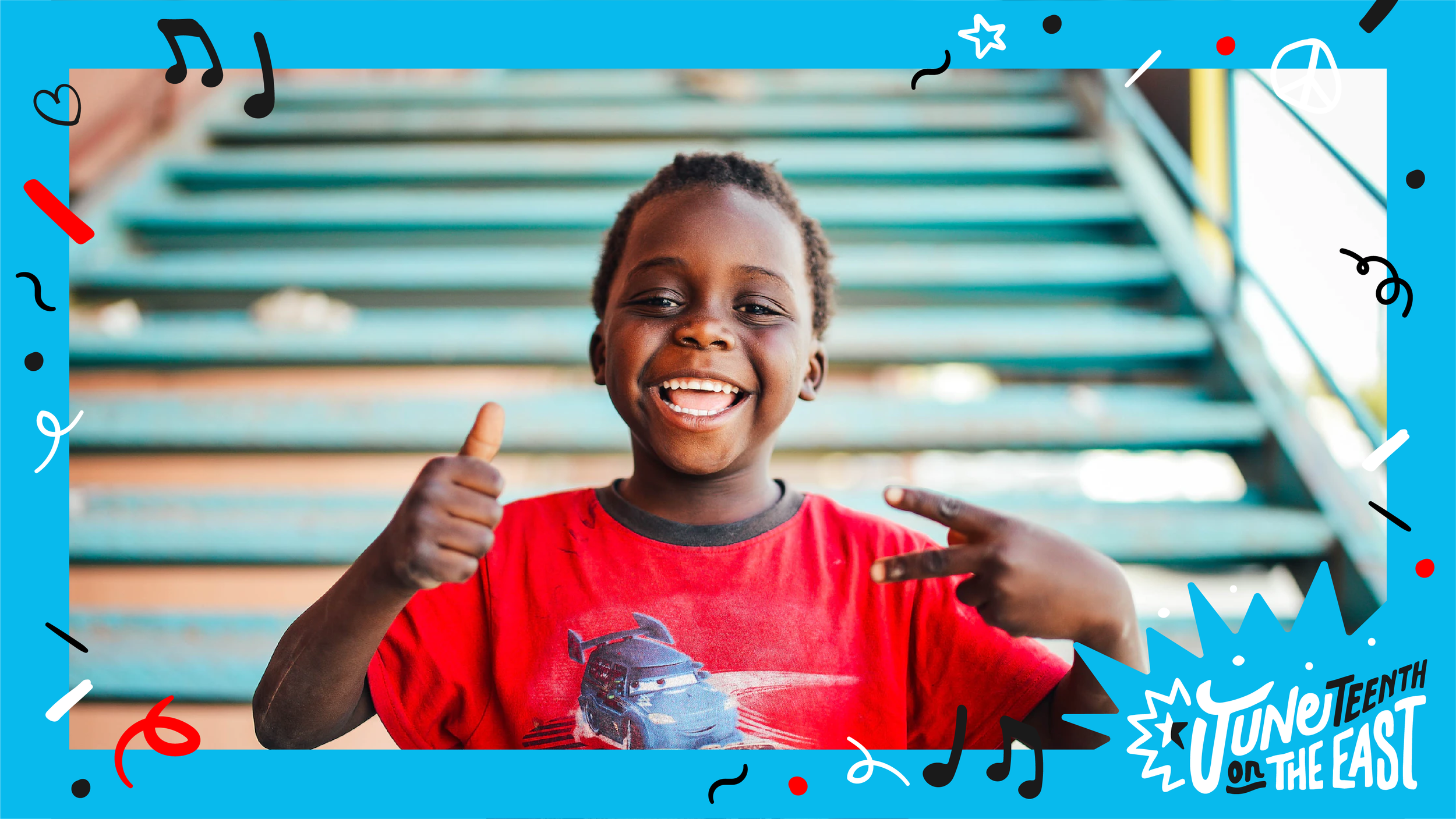
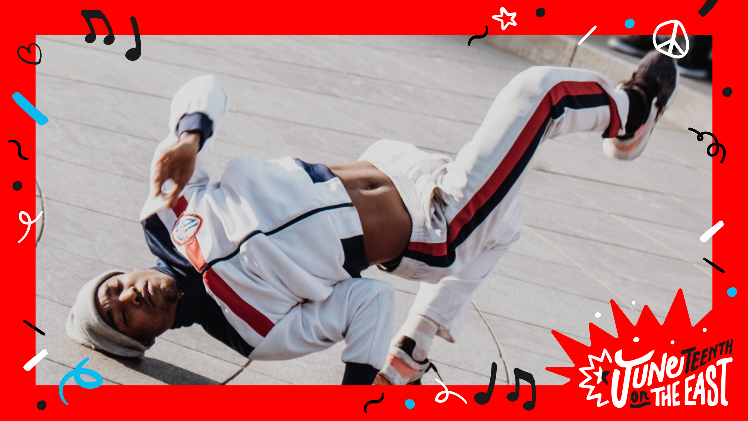
The photo treatment system includes a black-and-white treatment with a frame and color overlays for historic images, playful motifs from the pattern for more celebratory instances, and a collage style mixing image with brand elements for modern photos involving people. They embrace the history and celebration of Juneteenth on the East while creating a sense of community and inclusivity.
In collaboration with Flight Agency